Colour Drenching - Why does it work?
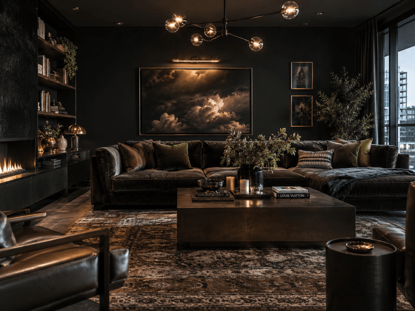
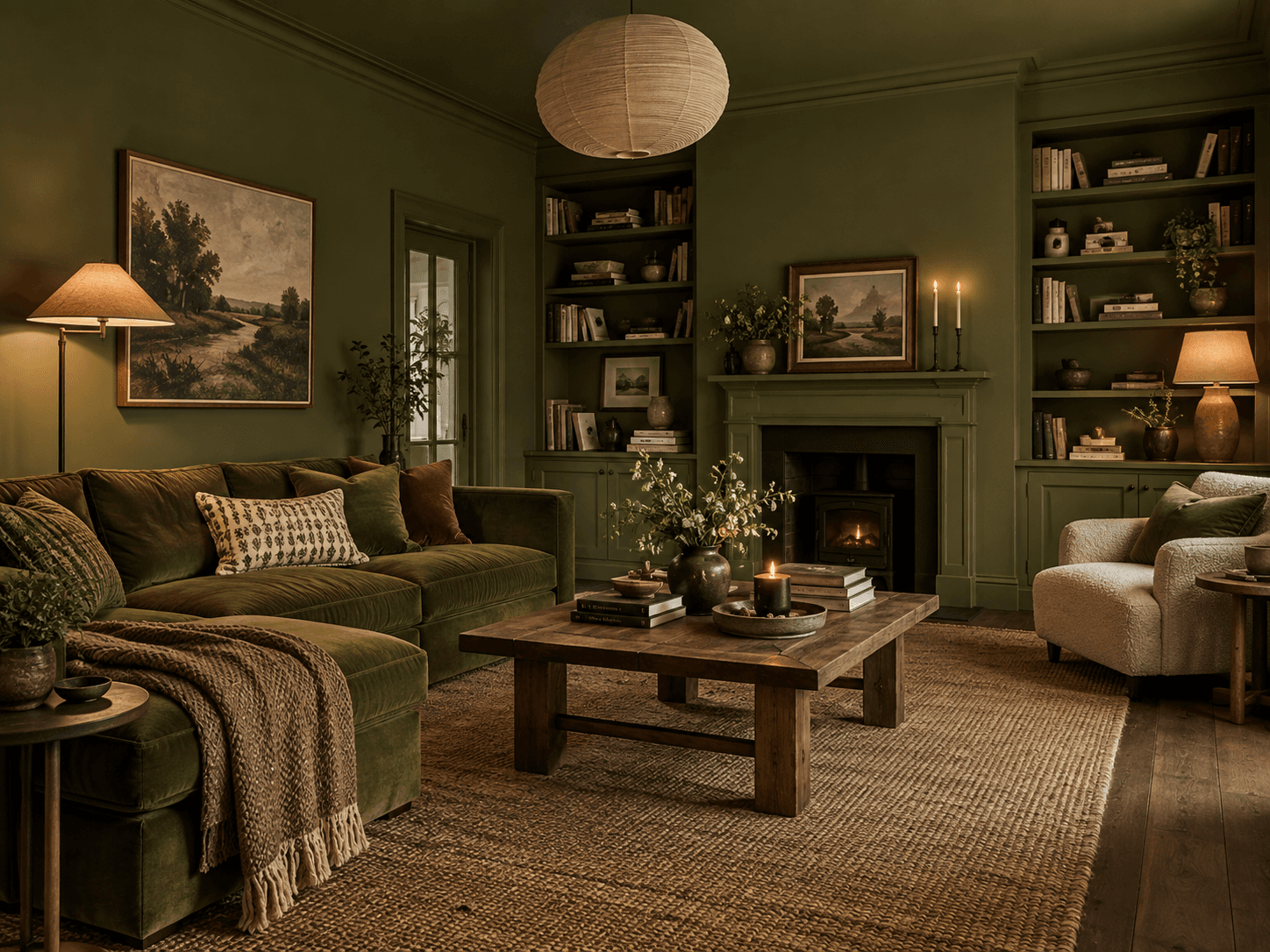
Colour drenching has become a huge interiors trend, and it is easy to see why. Instead of stopping at the walls, colour continues across skirting boards, doors, architraves, radiators and sometimes the ceiling too.
Taking away the usual bright white lines can completely change the proportions of a room. Your eye moves through the space without constantly being interrupted, which can help elongate long or narrow rooms and soften the edges of smaller spaces.
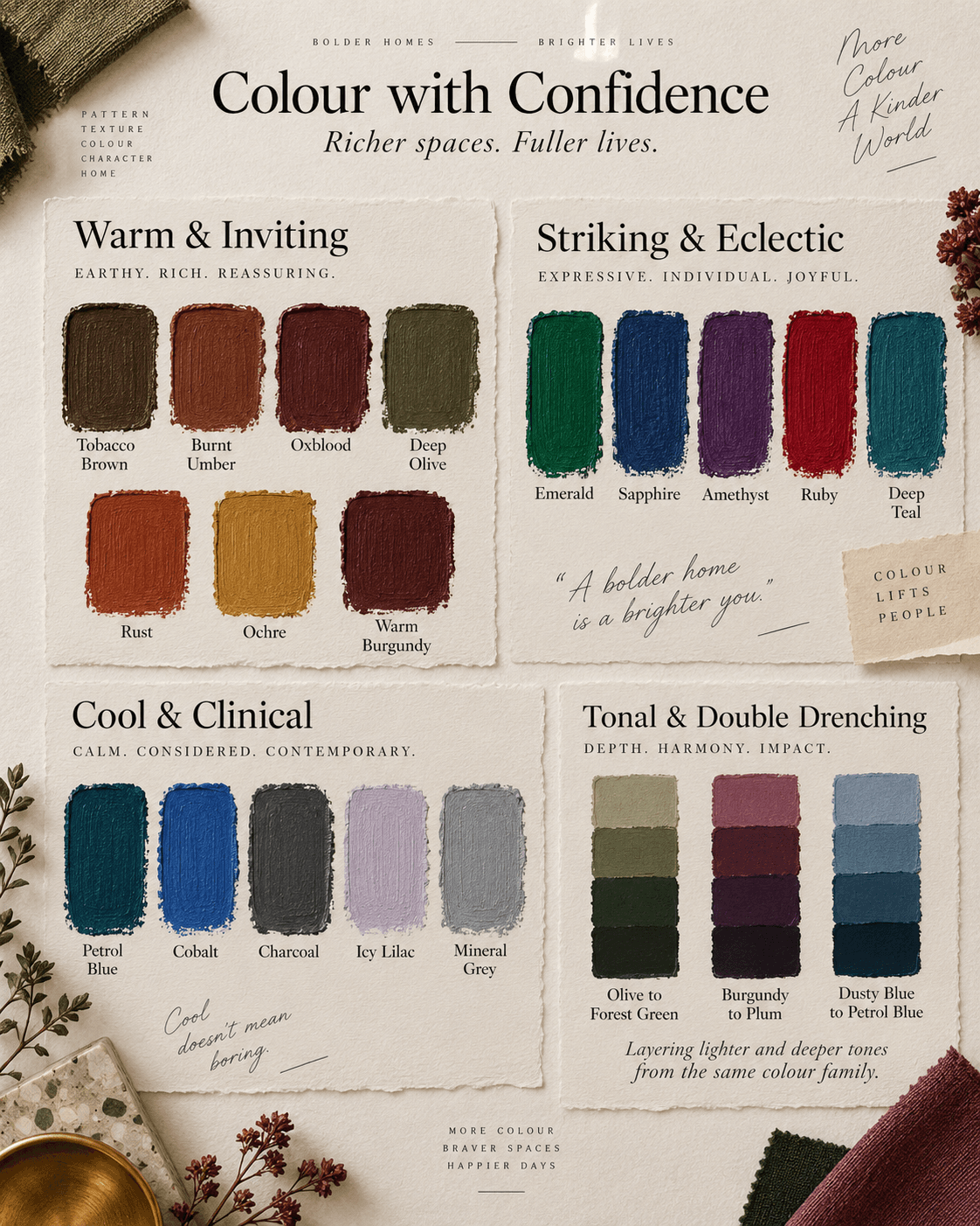
The colours being used are becoming richer too. Deep olive and moss greens, tobacco and chocolate browns, oxblood reds, aubergine and petrol blues bring depth and warmth and can make a room feel beautifully cocooning. Softer shades such as plaster pink, warm putty, mushroom, chalky blue, muted sage and earthy clay give the same sense of flow but with a much calmer feel.
You do not have to use one exact shade throughout either. Tonal drenching uses different strengths of the same colour, perhaps taking a deeper shade onto the woodwork and a softer version onto the ceiling. It is subtle, but it adds another layer of depth to the room.
"Double Drenching" takes this idea further by using two or more related colours with slightly different undertones. Think olive alongside a yellow green and a much deeper forest shade, or rich burgundy paired with softer red and plum tones. The colours still feel connected, but the slight differences make the room much more interesting.
It is part of a wider move towards using colour with more confidence. White ceilings and contrasting woodwork are no longer the automatic choice, and we are seeing colour used to change how a room feels rather than simply decorate the walls.
Dark colours do not necessarily make a room feel smaller either. Used across the whole space, they can blur boundaries, add warmth and create a sense of depth that you often lose when everything is broken up with white.
Sometimes giving a room more colour is exactly what makes it feel bigger, warmer and much more considered.
History of Maximalism - How We Learned To Love More Again
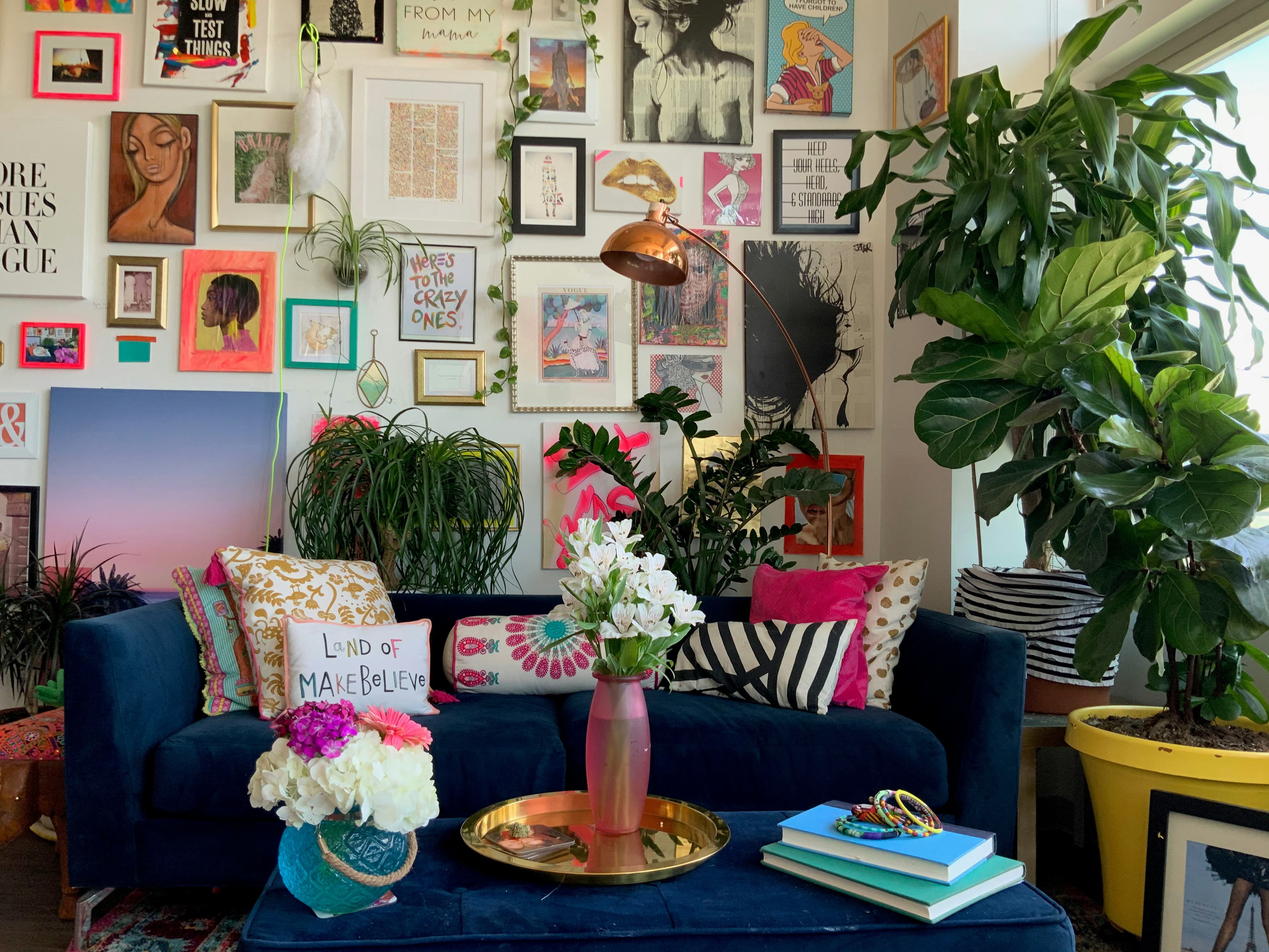
Maximalism feels very current, but the idea of filling our homes with colour, pattern, art and things we love has been around for centuries.
Victorian interiors are probably where it starts to feel most familiar. Patterned wallpaper, heavy fabrics, dark furniture, artwork, ceramics and collected objects all lived together, often with more than one pattern used in the same room. Homes became a way to show taste, personality and the things people had gathered over time.
William Morris added another layer to that love of pattern, with his botanical wallpapers and textiles bringing nature, detail and repetition into the home in a way that still feels relevant now.
Art Deco later introduced a more glamorous version, with velvet, brass, polished woods, mirrored surfaces and strong geometric shapes.
Then interiors became much cleaner and quieter for a while. White, grey, beige and Scandinavian inspired spaces took over, and homes became far more coordinated.
Now maximalism is back in a much freer form. Colour drenching, clashing prints, vintage furniture, gallery walls, bold lighting and a mix of old and new are all part of it.
What makes it work now is the same thing that made it work then. It gives people the confidence to create a home that feels personal rather than perfect.
How to Build a Maximalist Gallery Wall
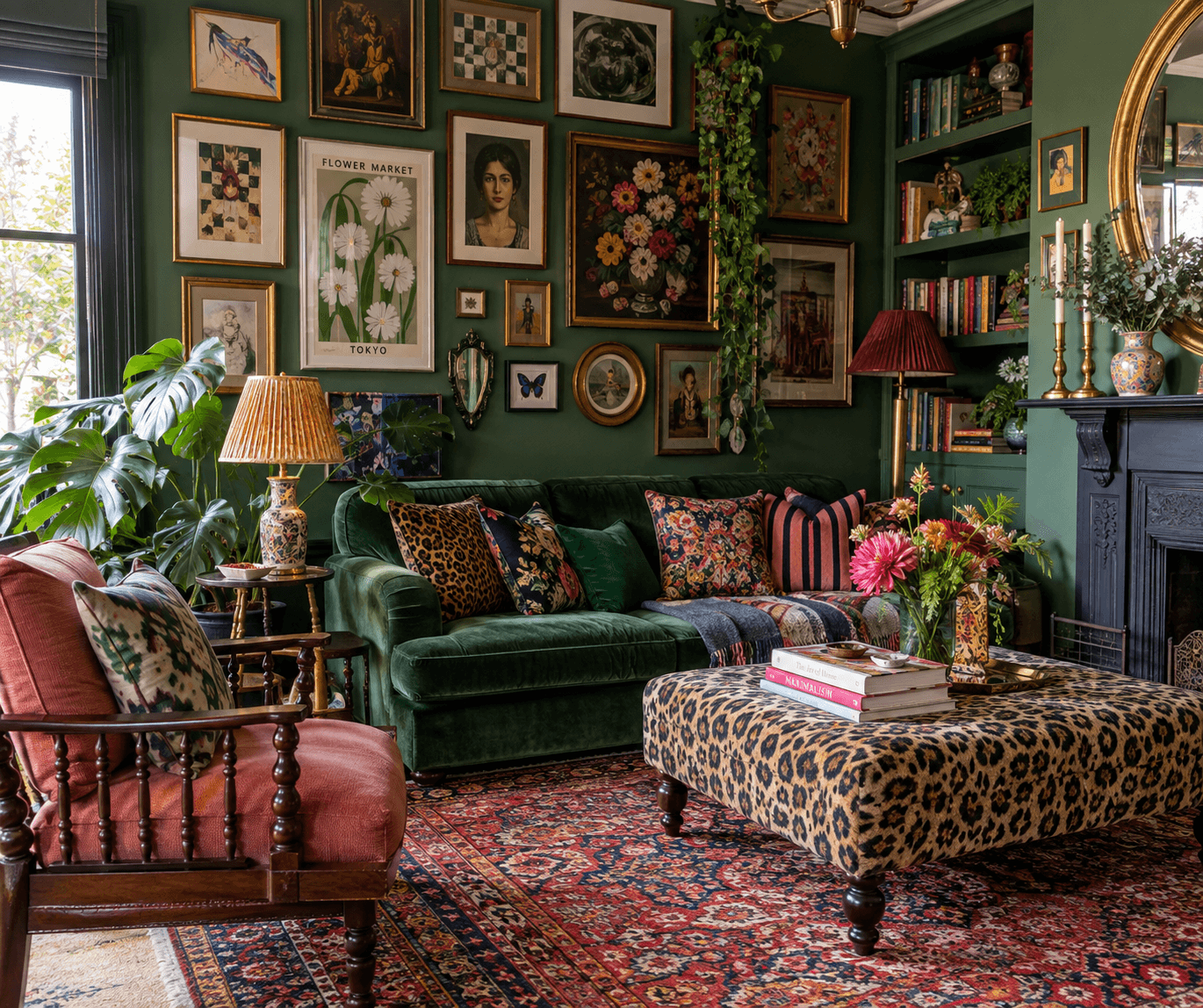
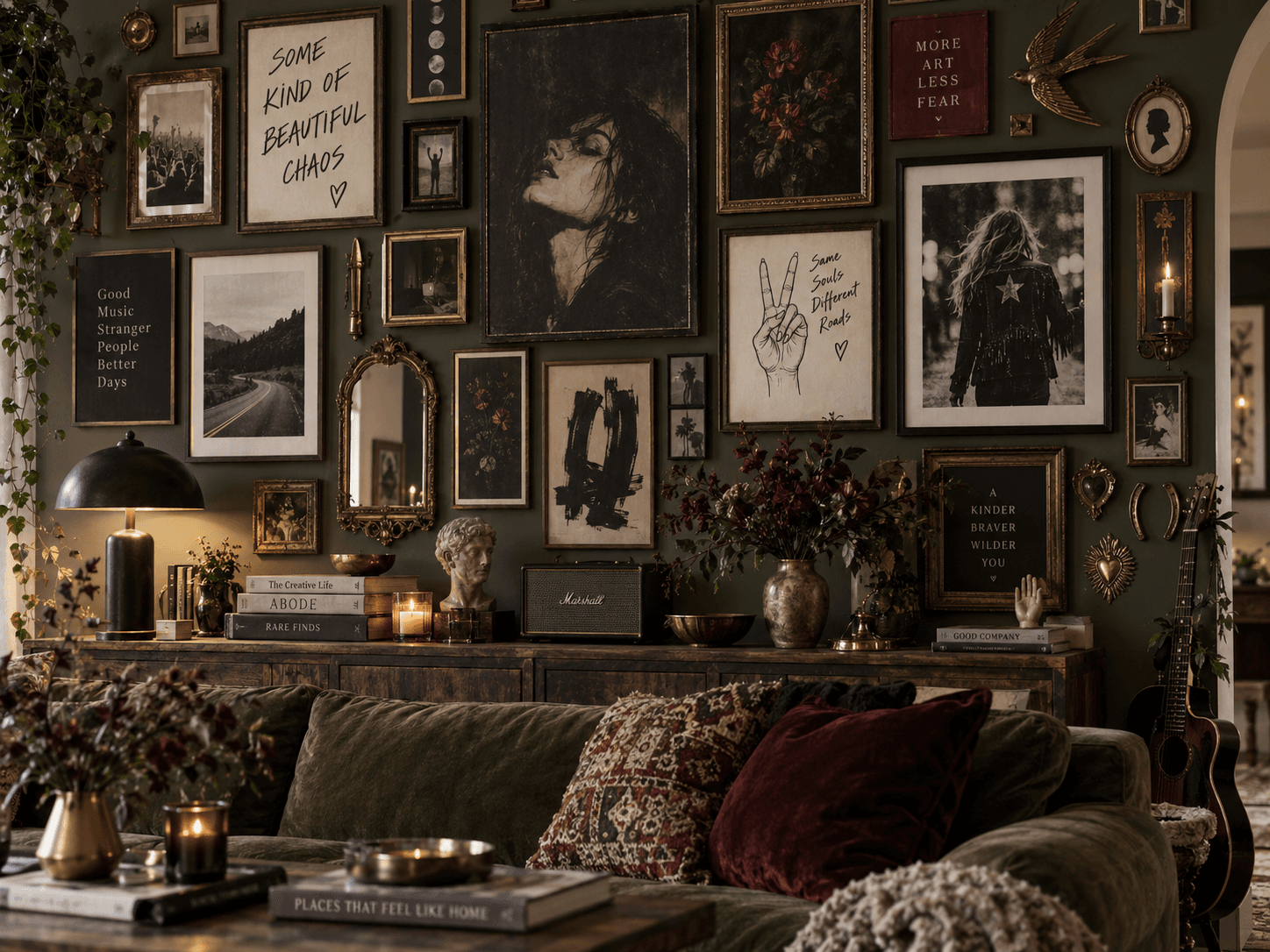
A maximalist gallery wall should feel like it has grown over time, not like it arrived in one box.
Start with pieces you actually love. Family photos, old prints, postcards, paintings, sketches, vintage finds, mirrors or something completely random that you have picked up because you liked it. It does not all need to match, and I actually think it is better when it doesn’t.
The easiest way to start is with one or two larger pieces. These give the wall a bit of structure and stop everything else feeling too small or scattered. From there, you can start filling the gaps with smaller frames and different shapes.
Mixing frames helps too. Black, timber, brass, painted or vintage frames can all work together. You just need a little balance across the wall so one finish does not end up sitting in one corner on its own.
Try not to make everything the same size. A mix of portrait, landscape, square and even round or oval frames gives the wall much more movement. If everything is too even, it can start to look a bit too organised, which is not really what you are going for with maximalism.
You can also mix in things that are not framed. Small mirrors, plates, letters, decorative objects or textiles can make the wall much more interesting and break up all the straight lines.
Before you start putting holes in the wall, lay everything out on the floor first. Move things around, take a photo, walk away from it and look again, ask your family and friends (if their opinion truly matters to you). You normally spot quite quickly if one side feels too heavy or something is sitting in the wrong place.
Spacing does not have to be perfect either. Keep it fairly consistent, but do not get too hung up on every gap being exactly the same. A gallery wall with a bit of irregularity usually feels much more relaxed and personal.
Rule 1: Do not feel like you have to finish it all in one go.
Start with what you have and leave yourself space to add to it. That is often what gives a gallery wall the most character, because it becomes a collection of things you have found and kept rather than something you bought to fill a wall.
The best ones are not perfect. They are personal.
Bold Colour, Done Well
If maximalism feels like you but bold colour still makes you hesitate, start with how you want the room to feel.
For something warm and inviting, look at tobacco brown, burnt ember, oxblood, deep olive, rust, ochre and warm burgundy. These colours have weight to them. They make a room feel settled, rich and almost cocooning, especially when they are layered with dark timber, velvet, wool, antique brass and warmer lighting.
If you want something more striking and eclectic, jewel tones are where maximalism really comes alive. Emerald green, sapphire blue, amethyst, ruby red and deep teal all have enough saturation to stand up against bold artwork, pattern and statement furniture. They do not need to match perfectly either. Sometimes it is the slight clash between them that gives the room its energy.
You can also take maximalism in a cooler direction. Petrol blue, cobalt, charcoal, icy lilac and mineral grey can feel much sharper and more graphic. Pair them with chrome, glass, lacquer or black details and you can create something that feels cleaner and more contemporary without losing any of the impact.
It is worth looking beyond the basic colour name too. A moss green and an emerald green might both be green, but they create completely different moods. One feels earthy and grounded, the other richer and more dramatic. The same applies to reds, blues and neutrals. Undertone and saturation matter just as much as the colour itself.
And if you already know the colours you naturally lean towards, do not be afraid to take them a little further.
If green is your safe place, try the deeper olive, forest or moss version. If you are drawn to neutrals, look at tobacco, clay, mushroom or putty rather than automatically reaching for beige. If you love blue, try petrol or ink instead of something pale.
This is maximalism. Going deeper, richer and more saturated is often what gives the room its character.
Print and texture are just as important as the paint. A strong wall colour can completely change again once you add striped upholstery, a floral curtain, velvet, patterned rugs, artwork or darker timber. These layers stop the colour feeling flat and help the whole space feel more intentional.
Before you commit, try tester pots from brands such as Farrow & Ball, Little Greene, Paint & Paper Library or whichever paint range you are drawn to. Test a few shades from the same family rather than relying on one colour card, because the difference between two seemingly similar shades can be huge once they are on the wall.
Before even buying the tester pots, you can use our AI Visualiser to see how different colours might look in your own room. It is a really useful way to compare a safer shade against something deeper or more dramatic and get a feel for how far you actually want to push the room.
Then once you have the paint, test it properly.
Paint a decent sized area and look at it throughout the day. Morning light, direct afternoon sun, a darker evening and artificial lighting can all completely change the same colour. North facing light can pull out cooler undertones, while warmer evening light can make earthy shades feel much richer.
Also look at the colour alongside the things that are staying in the room. Flooring, furniture, curtains and even the colour of the light bulbs can change how the paint reads.
A shade that looks too dark at midday might feel absolutely perfect once the lamps are on in the evening.
That is why testing matters.
The aim is not to choose the boldest colour just for the sake of it. It is about finding the shade that gives the room the mood you want and then having the confidence to commit to it.
Maximalism rewards that confidence, and quite often the slightly braver choice is the one that makes the whole room fall into place.
Choosing One Piece to Anchor the Room
One of the easiest ways to give a maximalist room some structure is to start with one piece that has real presence.
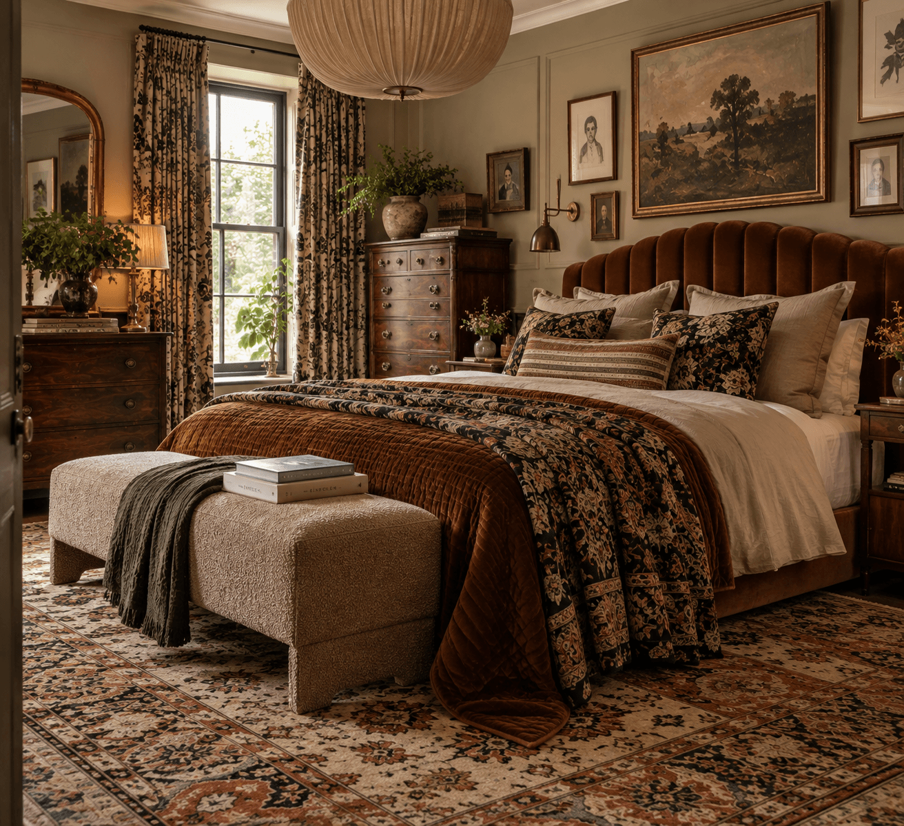
That might be a sofa, an antique cabinet, a large rug or a dramatic light fitting, but fabric is often where the room really starts to take shape.
A sofa in velvet, mohair, boucle or a heavily textured weave can instantly become the anchor because the fabric changes how the whole piece reads. Velvet gives depth because of the way the pile catches the light. Mohair feels richer and slightly more tailored. A textured weave can make a large piece feel softer and more relaxed.
Patterned upholstery can be even more powerful.
A striped sofa, floral armchair or large scale print gives you something to build from without needing the rest of the room to match it exactly. In fact, the strongest schemes often do the opposite. They take one detail from the fabric and reinterpret it elsewhere through a rug, artwork, drapery or another print in a completely different scale.
This is where fabric layering becomes important.
Curtains, cushions, upholstered furniture and rugs should not all be doing the same job. Mixing different weights and finishes gives the room depth. Heavy drapery beside a finer linen, velvet against a flatter cotton, a dense patterned rug under cleaner upholstery. The contrast is what stops the room feeling one dimensional.
Scale matters with pattern too. A large botanical print can sit comfortably beside a narrow stripe or smaller geometric pattern because your eye reads them differently. If everything is the same scale, the room can start to feel busy rather than layered.
Drapery can also become part of the focal point rather than something that just frames a window. Full length curtains in a strong fabric can add height, softness and movement, particularly when they are generous enough to fall properly rather than sitting tight to the glass.
The same applies to rugs. A large patterned rug can visually pull the furniture together and set the rhythm for the rest of the room. It gives you a foundation to work from rather than becoming something you add at the end.
If you are unsure which piece should lead the room, use the WIW Visualiser to try a few directions before you commit. Test a velvet sofa against a patterned rug, swap in a stronger chair or try a larger scale print and see which element gives the room the clearest focal point.
Once you have that one strong piece, everything else can start to respond to it.
Repeat a fabric texture. Echo a motif. Pick up the shape of a pattern somewhere else. Let the materials speak to one another without making everything identical.
That is what makes maximalism feel intentional.
The room can still be full of pattern, texture and different influences, but one strong anchor gives all of those layers somewhere to start.
How to Mix Prints Like a Maximalist
Mixing prints is probably one of the parts of maximalism people are most nervous about. One pattern feels manageable. Two starts to feel brave. By the time you are looking at a floral wallpaper, striped curtains and a patterned rug, it is very easy to convince yourself it is all too much.
But conflicting prints are a huge part of what makes maximalist interiors feel so interesting.
I would start with one print you really love and let that lead the room. It could be a large botanical wallpaper, a patterned rug, a heavily printed curtain fabric or even an upholstered chair. This becomes your hero print and gives you something to work from rather than choosing lots of patterns separately and trying to make them fit afterwards.
Then look at scale.
This makes far more difference than whether two prints technically match. A large sprawling floral will usually sit much more comfortably next to a narrow stripe, small check or tighter geometric because each pattern has a different visual weight.
Put several busy prints of exactly the same scale together and they can start fighting for attention.
You want some patterns to lead and others to sit behind them.
Stripes are particularly useful because they bring structure into a room. They can break up florals, paisleys and more fluid botanical designs without making the scheme feel plain. Checks and geometrics can do the same thing.
Then add something with movement.
A trailing floral, abstract print or looser organic pattern feels completely different beside the straight lines of a stripe or check. That contrast is often far more interesting than trying to find another print that looks similar.
Colour is what can quietly hold everything together.
The patterns do not have to match, but finding a colour that appears more than once can make very different prints feel connected. It might only be a small tone buried in the original fabric that you then pick up again somewhere else.
That little bit of repetition gives the room rhythm without making it look overly coordinated.
Do not forget texture either. Pattern does not only come from printed fabric. Boucle, embroidery, woven checks, velvet, tapestry, pleating and even the grain of an old piece of timber can all add another layer without introducing another obvious print.
And not every surface needs one.
A maximalist room still needs somewhere for your eye to rest. A block colour sofa between patterned curtains and a busy rug can actually make both of those prints look stronger. The quieter pieces are often doing more work than you realise.
Most importantly, do not get too caught up in whether two patterns are supposed to go together.
Put them next to each other.
Move them around.
Look at them from across the room rather than six inches away.
Some of the best combinations have a slight clash to them. They should feel connected, but they definitely do not need to behave.
That bit of tension is often what gives a maximalist room its character.
Why Lighting Changes Everything
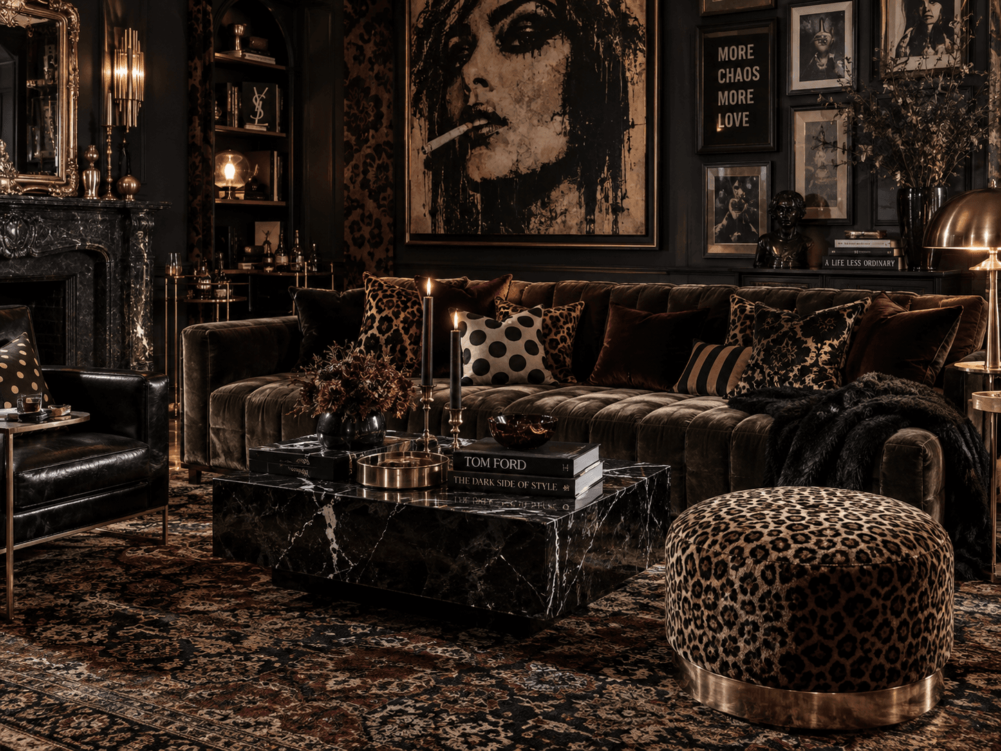
Lighting can completely change the way a maximalist room feels. You can have the perfect colour palette, layers of pattern, beautiful fabrics and walls full of art, but if the lighting is flat, the whole room can lose its depth.
The best schemes rely on layers. Ambient lighting gives the room its overall glow, task lighting adds function where you need it, and accent lighting helps draw attention to artwork, architectural details or particular pieces of furniture. When those layers work together, the room feels much more considered.
This is especially important in maximalist interiors because there is usually more texture, colour and detail to bring out. Velvet, lacquer, aged timber, brass, glass, marble and patterned textiles all respond differently to light. A soft pool of light across a velvet sofa can bring out the richness of the pile, while a picture light or directional wall light can make artwork feel much more intentional.
Statement lighting can also act as part of the visual hierarchy. An oversized pendant, sculptural floor lamp, pleated shade or piece of coloured glass can become a focal point in its own right, especially when it echoes a shape, texture or finish elsewhere in the room.
Warm light generally works beautifully in layered interiors because it softens deeper colours and gives the room a more inviting feel. Cooler light can make the same space feel sharper and flatter, so colour temperature really matters. Dimmers are useful too, particularly if you want the room to feel one way during the day and completely different once the evening sets in.
It is also worth thinking about where the light actually falls. Pools of light create contrast, and contrast creates atmosphere. Rather than flooding the entire room evenly, let some areas sit slightly darker while others are picked out. That change in light level gives the room more dimension and allows different parts of the space to reveal themselves gradually.
If you are deciding between a statement pendant, wall lights or adding more lamps, use the WIW Visualiser to try them in your own room first. It can help you judge the scale of a fitting, where the room needs another layer of light and whether a stronger piece will enhance the scheme or compete with everything already happening.
Maximalist rooms rarely need more things. They usually need better lighting.
The right combination of lamps, pendants, wall lights and accent lighting can make colour feel richer, texture feel deeper and the whole room feel far more alive.
Making Furniture Feel Bespoke
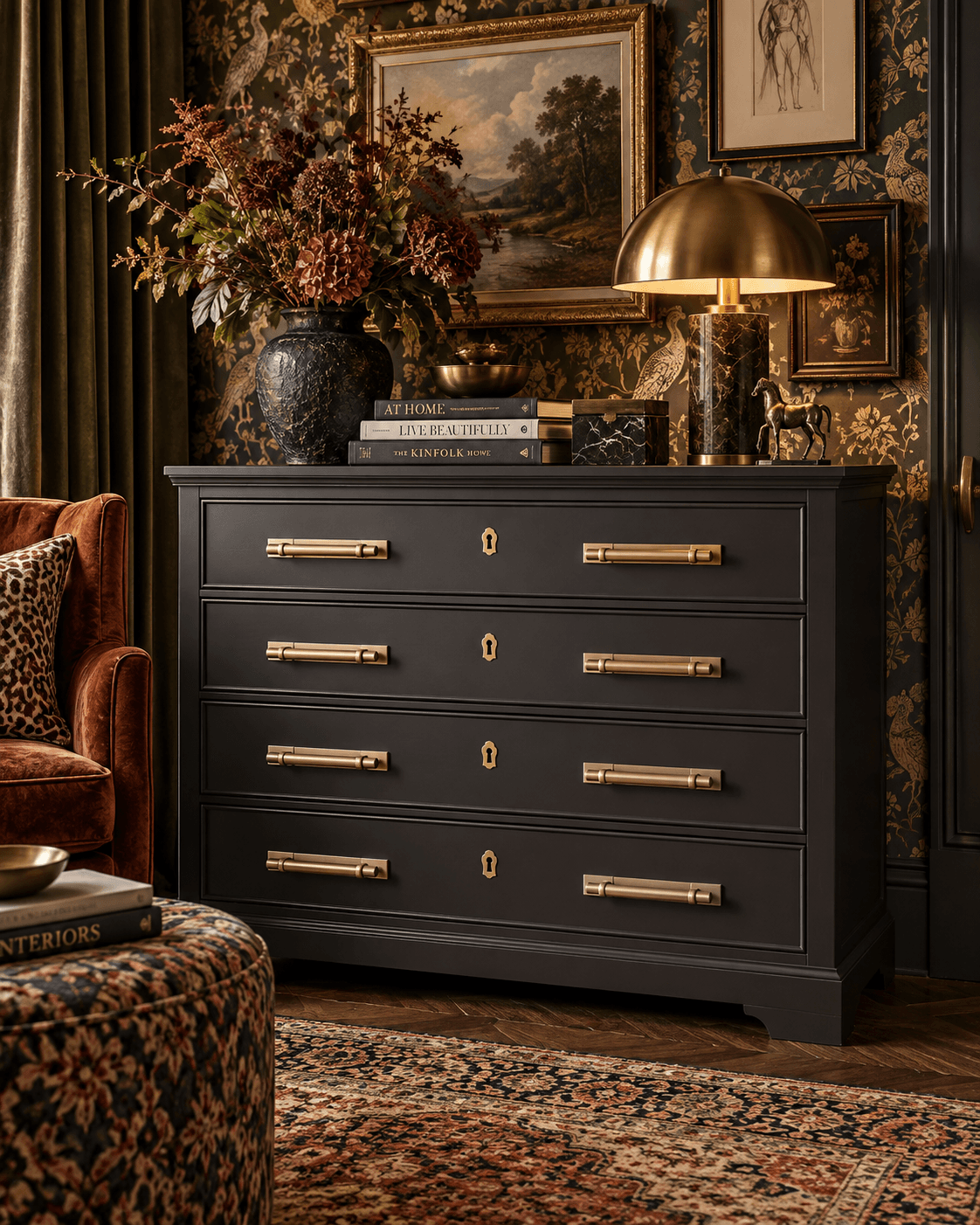
One of the easiest ways to change the character of a piece of furniture is through the hardware.
Handles and knobs might be small, but visually they behave almost like jewellery. They can sharpen a piece, soften it, make it feel more traditional, more contemporary, more playful or much more considered.
This is especially useful when you are upcycling.
A fairly plain chest of drawers can feel completely different with oversized brass pulls. An old timber cabinet can take on a much more contemporary feel with something sculptural or graphic. A painted bedside table can become far more individual with ceramic, glass or textured hardware.
The important thing is to look at the piece as a whole.
Think about proportion, material, finish and shape rather than simply replacing one handle with another of the same size. A large drawer can often take something more substantial, while a delicate cabinet may suit a smaller knob or finer pull.
Material makes a huge difference too.
Unlacquered brass will develop patina over time. Polished metal feels cleaner and sharper. Ceramic can bring pattern and colour. Glass adds lightness. Timber feels softer and more organic. Knurled, hammered and ribbed finishes introduce texture before you have even added anything else to the room.
For a maximalist interior, hardware is a brilliant place to add a little visual tension.
A very traditional piece of furniture can take a surprisingly modern handle. A simple painted cabinet can carry something ornate. You can use animal forms, florals, abstract shapes, sculptural pulls or oversized knobs without the whole room having to follow the same theme.
That contrast is often what makes the piece interesting.
You can also use hardware to connect furniture back into the wider room. Repeat a metal finish already used in the lighting, echo a curve from another piece of furniture, or pick up a shape that appears somewhere else in the scheme.
It does not need to match perfectly.
It just needs to feel intentional.
And if the furniture itself is fairly simple, this is where you can afford to take a bigger risk. Hardware gives you a chance to add character without committing to a major change.
Sometimes the difference between a piece that looks ordinary and one that feels bespoke really is that small.
The Fifth Wall - Ceilings
The ceiling is one of the most overlooked surfaces in a room, yet it can have a huge impact on how the space feels.
In interior design it is often referred to as the fifth wall, and in a maximalist scheme it should be treated with the same consideration as the rest of the room.
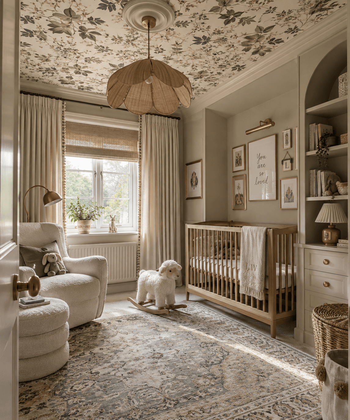
That does not always mean using pattern. Simply carrying the wall colour onto the ceiling can make a room feel more cohesive and enveloping. It removes the visual break between wall and ceiling and can help the space feel more finished.
Wallpaper is another strong option. Florals, stripes, geometrics and more decorative prints can work beautifully overhead, particularly in smaller rooms where the ceiling can become part of the overall design rather than an afterthought.
Architectural details such as cornicing, ceiling roses and mouldings are also worth using to your advantage. They can be painted into the scheme, picked out in a contrasting tone or used to frame a wallpapered ceiling.
The ceiling is also a good place to take a slightly bolder approach. Darker paint, stronger pattern or a higher sheen can all add depth and interest without relying on more furniture or accessories.
Lighting becomes part of this too. A chandelier or sculptural pendant feels far more intentional when the ceiling around it has been considered as part of the design.
If you are unsure how far to take it, use the WIW Visualiser to test the ceiling before you commit. Try carrying the wall colour overhead, introducing a darker tone or adding pattern, and see how it changes the proportions and overall feel of the room.
The main thing is to stop seeing the ceiling as something that automatically has to be white.
In the right room, the fifth wall can be one of the strongest parts of the whole scheme.
Small Space, Big Personality
Small does not have to mean safe.
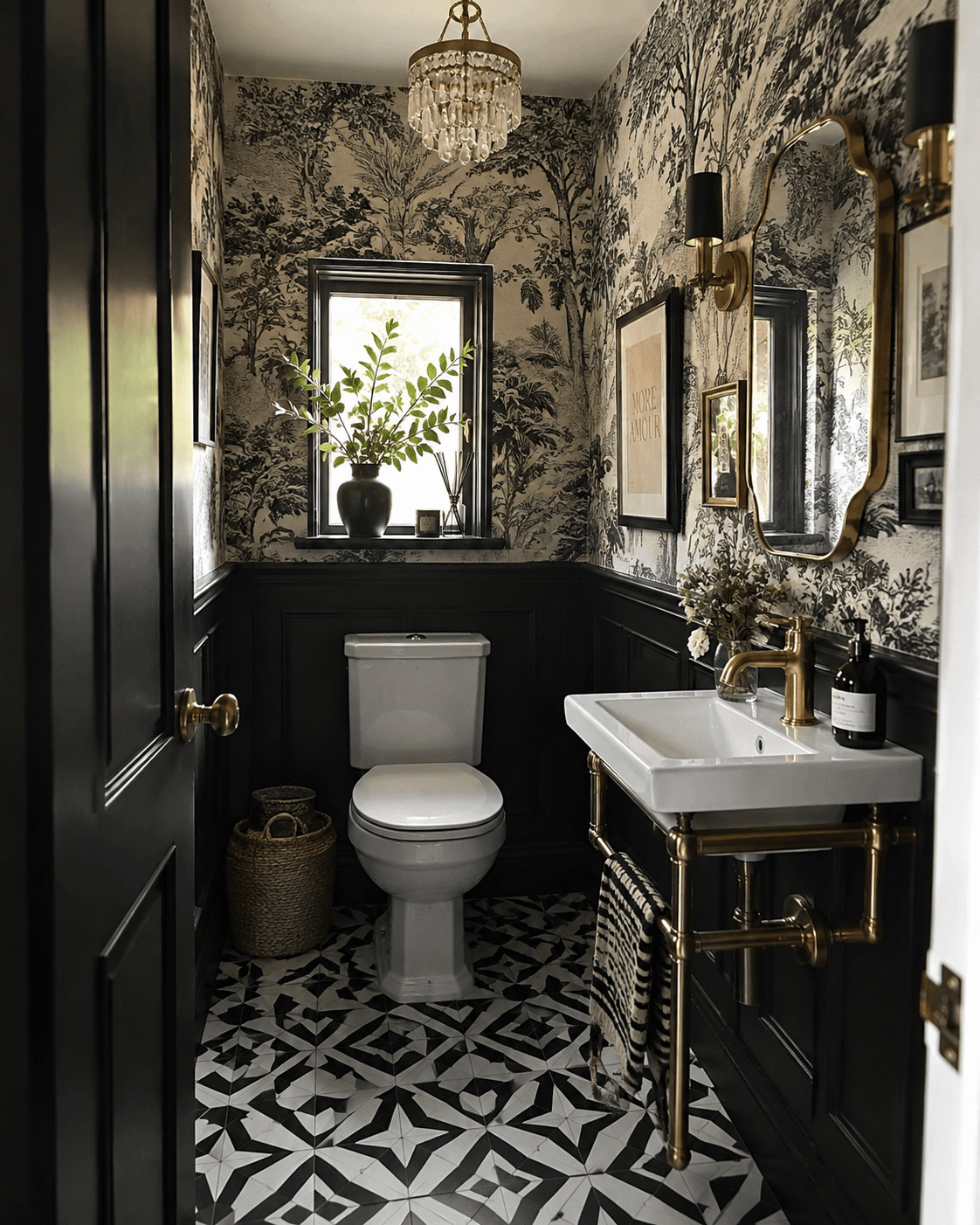
Some of the best places to use maximalism are the rooms we usually play down. Hallways, box rooms, downstairs toilets, small bedrooms and awkward corners can take far more colour, pattern and personality than we tend to give them credit for.
The key is to stop trying to make every small space look bigger and start thinking about how you want it to feel.
A tiny room can be wrapped in wallpaper, colour drenched from floor to ceiling or given one oversized piece of artwork and suddenly feel far more considered. Sometimes leaning into the scale of the room creates more impact than trying to disguise it.
Scale still matters though. Do not automatically fill a small room with lots of tiny furniture and accessories. One larger mirror, a generously sized rug or a statement light can make the space feel stronger and more balanced than lots of smaller pieces competing for attention.
Use the height too. Gallery walls, tall shelving, floor length curtains and wallpaper carried onto the ceiling all draw the eye upwards and make the room feel more layered.
Pattern can work just as well, especially when you vary the scale. A large floral with a smaller stripe or check gives the room movement without making every surface feel equally busy.
Lighting is important in tighter rooms too. Wall lights, lamps and reflective finishes can add depth and stop darker colours feeling flat.
The real trick is keeping the useful clutter under control so the decorative layers still feel intentional. Hidden storage, baskets, fitted joinery and furniture that earns its place all help.
Maximalism in a small space is not about squeezing more into it.
It is about making every choice count.
Window Dressings with Presence
Window treatments have a huge influence on how a room feels. They affect proportion, light, privacy and softness, but they also frame the view and help define the overall character of the space.
Full length curtains are one of the strongest ways to add height and presence. Hung close to the ceiling and taken right down to the floor, they draw the eye upwards and can make the room feel taller and more generous. Heavier, well lined fabrics also give the curtain a better drape and weight, which immediately makes the finish feel more considered.
The choice of fabric matters. Velvet, dense linen, jacquard and heavier woven fabrics create depth and movement, while lighter sheers can soften the window without blocking natural light. In a maximalist room, pattern can be used confidently here too, especially when the curtain fabric picks up tones or motifs already used elsewhere in the scheme.
Blinds offer a different kind of structure. Roman blinds bring softness and are ideal for introducing print, while roller blinds give a cleaner finish and can sit behind curtains without competing with them. Wooden or Venetian blinds add stronger lines and texture, while woven or natural blinds can soften a more formal room.
Layering different treatments can work particularly well. A Roman blind beneath full length curtains, or a sheer behind a heavier drape, gives you far more control over privacy and light while adding another level of depth to the window.
Privacy film is also worth considering where you want to retain daylight without leaving the room exposed. Frosted, reeded or decorative finishes work especially well in bathrooms, hallways and street facing rooms and can become part of the design rather than simply a practical solution.
Pelmets are another detail that can completely change the finish. Upholstered or fabric covered pelmets can give the window more structure, hide tracks and make the whole treatment feel far more bespoke. In a maximalist room, they also offer another opportunity to introduce pattern, contrast or a stronger silhouette.
The styling around the window matters too. A large floral arrangement, sculptural lamp, collected ceramics or a trailing plant can help connect the window back into the rest of the room rather than leaving it as an isolated feature.
Before committing, use the WIW AI Visualiser to test different combinations in your own space. Seeing a full length curtain, patterned blind, deeper pelmet or privacy treatment in context can make it much easier to judge scale, proportion and whether the window needs more or less presence.
The best window dressing should feel as though it belongs to the architecture of the room, not something added after everything else.
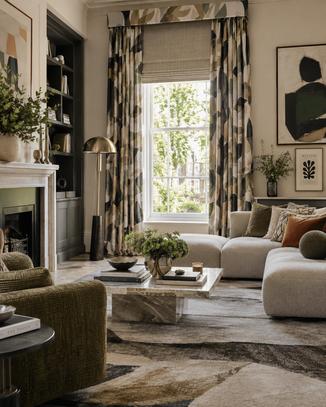
Why Old and New Work Better Together
Some of the most interesting rooms are the ones that have clearly been built over time.
That does not mean everything has to be antique or expensive. A high street sofa can sit brilliantly beside an inherited chest of drawers. A designer lamp can work next to a bargain side table. A chair found in a second hand shop can become one of the strongest pieces in the room once it is reupholstered in the right fabric.
It is the combination that gives the room depth.
Older furniture brings patina, craftsmanship and a sense of history that is difficult to reproduce. Worn timber, aged brass, original handles and the marks that come with years of use all add something to a space. In a maximalist room, those imperfections are often part of the appeal rather than something that needs hiding.
Newer pieces give you contrast. Cleaner lines, modern upholstery, contemporary lighting or something more sculptural can sit alongside traditional furniture and stop the room feeling tied to one particular period.
And there is absolutely nothing wrong with the high street. The skill is in choosing individual pieces rather than buying the entire room from one collection. Mix a more expensive investment piece with something from IKEA, Homesense, H&M Home or a supermarket find if it works. Price does not automatically determine whether something belongs in a well designed room.
The same applies to second hand and thrifted pieces. Charity shops, antique centres, reclamation yards, auctions and Marketplace can turn up furniture and accessories that you would never find in a mass produced collection. Sometimes they need a little work. Sometimes they are perfect exactly as they are.
Inherited and gifted pieces can be even more valuable because they bring a story with them. You do not have to design an entire room around your grandmother's cabinet, but placing it beside something contemporary can make both pieces feel more interesting.
Crafted pieces and work from small businesses add another layer again. Handmade ceramics, original artwork, bespoke cushions, small batch lighting or furniture made by an independent maker give a room individuality because they have not been produced for thousands of identical homes.
That is really the point.
Maximalism works best when the room feels assembled rather than purchased.
Choose things because you love them, not because they all came from the same range. Let the expensive piece sit next to the bargain. Keep the inherited furniture. Buy the strange little object from the independent shop. Refinish something old rather than replacing it.
The result should feel collected, personal and impossible to recreate exactly.
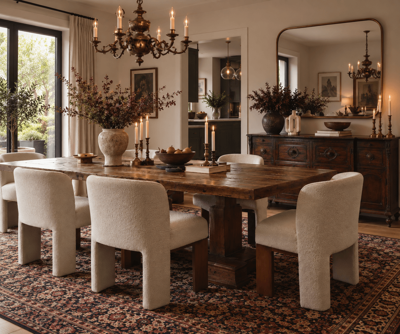
The Art of a Collected Home
A collected home is not defined by the number of objects in it, but by the way those objects are composed.
Whether you are styling a sideboard, open shelving, a coffee table or a display cabinet, the strongest arrangements tend to have a clear hierarchy. Larger pieces establish the structure, while smaller objects are used to create rhythm and detail around them.
Variation in height, scale and depth is important. Books can be stacked to create platforms, artwork can sit behind sculptural pieces, and objects can overlap slightly rather than being arranged in a single line. These changes stop a display from feeling flat and give it more visual movement.
Repetition also helps bring order. A recurring material, finish, shape or colour can connect pieces that are otherwise completely different.
Negative space matters just as much. Leaving areas deliberately quieter gives stronger groupings more impact and prevents a display from becoming visually heavy.
The aim is not perfection. It is balance, proportion and enough variation to make the arrangement feel considered rather than staged.
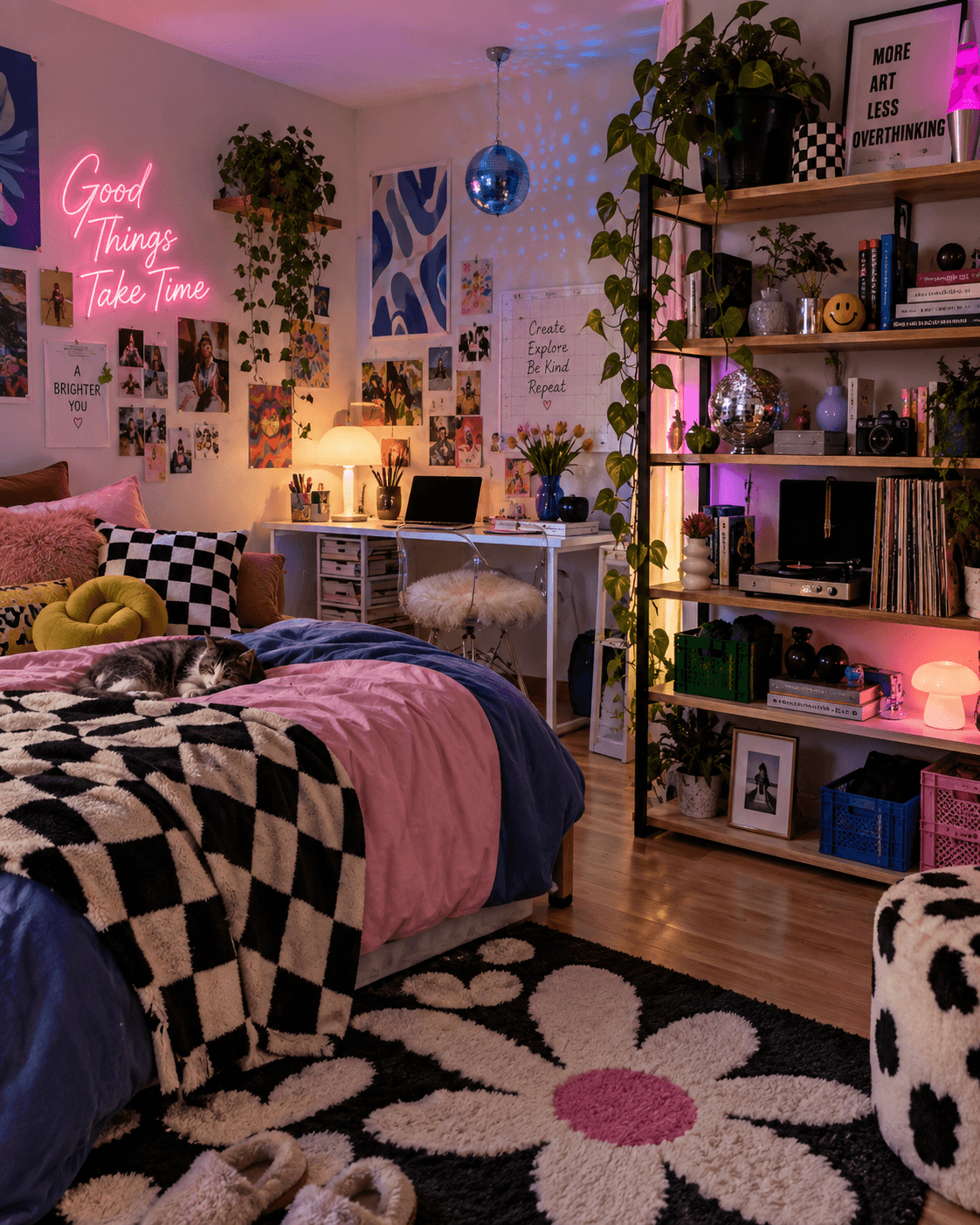
Budget Maximalism: More Style, Spend Less
Maximalism does not need a huge budget. In fact, some of the strongest rooms are the ones that have been built slowly, piece by piece, with a mix of high street, second hand, inherited, handmade and upcycled finds.
Social media marketplaces, eBay, online auctions, charity shops and preloved sellers are brilliant places to look because you are far more likely to find something with character. Try to look past bad listing photos or dated styling and focus on the shape, proportion and material of the piece. A solid timber cabinet, unusual chair or oversized mirror can have far more presence than something brand new once it is placed in the right setting.
It helps to know when to wait too. Watch the sales, save items you love and keep an eye on discontinued lines, ex display pieces and end of season reductions. If something has a small scratch, chip or cosmetic mark, ask for a better price. If the structure is sound, that damage can often be repaired, painted or disguised.
Charity shops are particularly good for smaller pieces such as artwork, ceramics, glassware, lamps and frames. These objects can add variation in shape, texture and finish without spending very much, and the money is being put to good use at the same time.
Swapping with friends and family is worth doing too. A lamp, chair or side table that no longer works in one home might be exactly what another room needs. Maximalism gives you much more freedom to mix different styles and eras, so these pieces do not need to come as a matching set.
And before buying anything, look at what you already have.
Changing the hardware on a chest of drawers, repainting a cabinet, reupholstering a chair or recovering a headboard can completely alter the way a piece reads in the room. Fabric remnants, leftover wallpaper, tester pots and second hand frames are all useful because they let you add colour, pattern and texture without starting again.
The aim is not to fill the room cheaply. It is to build a scheme with contrast, patina, texture and personality, then spend where it matters most.
Sometimes the best piece in the room is the one you nearly scrolled past.
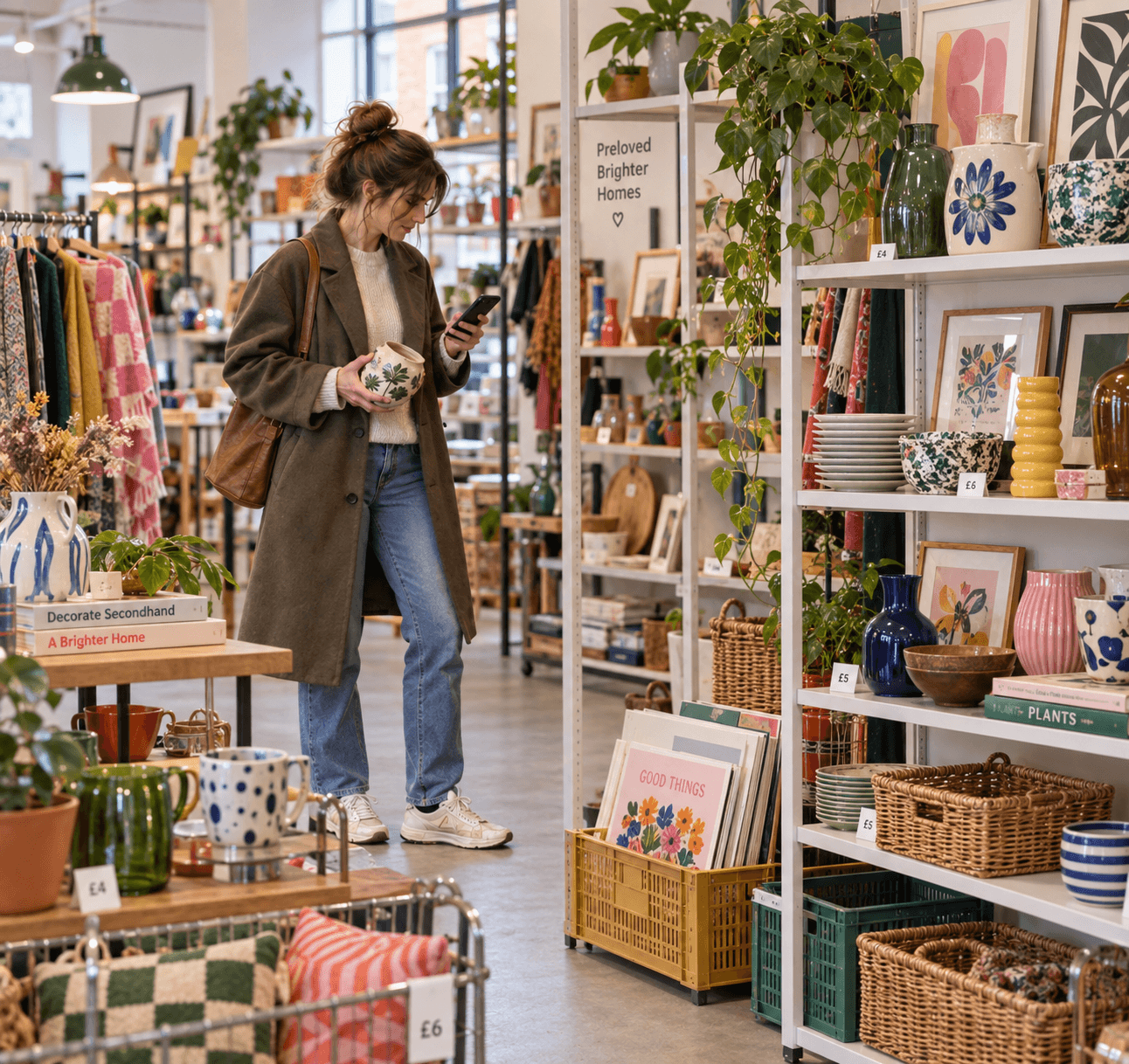
Knowing When to Stop
Maximalism is expressive, but the strongest rooms are still carefully edited.
Once you have layered colour, pattern, artwork, lighting, furniture and collected pieces, it is worth stepping back and looking at the room as a whole. The question is not whether you can add more, but whether every element is still contributing to the scheme.
Visual hierarchy is important. Your eye should have somewhere to land first, then move naturally around the room. If the sofa, rug, gallery wall, lighting and shelving are all competing at the same level, the space can start to lose its focus.
This is where quieter areas become useful. A simpler wall, a cleaner surface or a piece of furniture with less pattern can create enough negative space to let the stronger elements breathe. It does not make the room less maximalist. It gives the layers around it more impact.
Look at scale and repetition too. If several pieces are similar in size, pattern or visual weight, the room can begin to feel crowded. Removing one piece, changing the position of another or creating a little more space between them can completely rebalance the composition.
Sightlines matter as well. Stand at the doorway and look at what you notice first. Move around the room and see where your eye naturally goes. If one area feels too heavy or another disappears completely, that is usually where the editing needs to happen.
And sometimes the best thing you can do is take something away.
Maximalism should feel full of personality, not full for the sake of it. The skill is knowing when the room has enough character, enough contrast and enough detail to feel complete.