Wall Panelling and Moulding
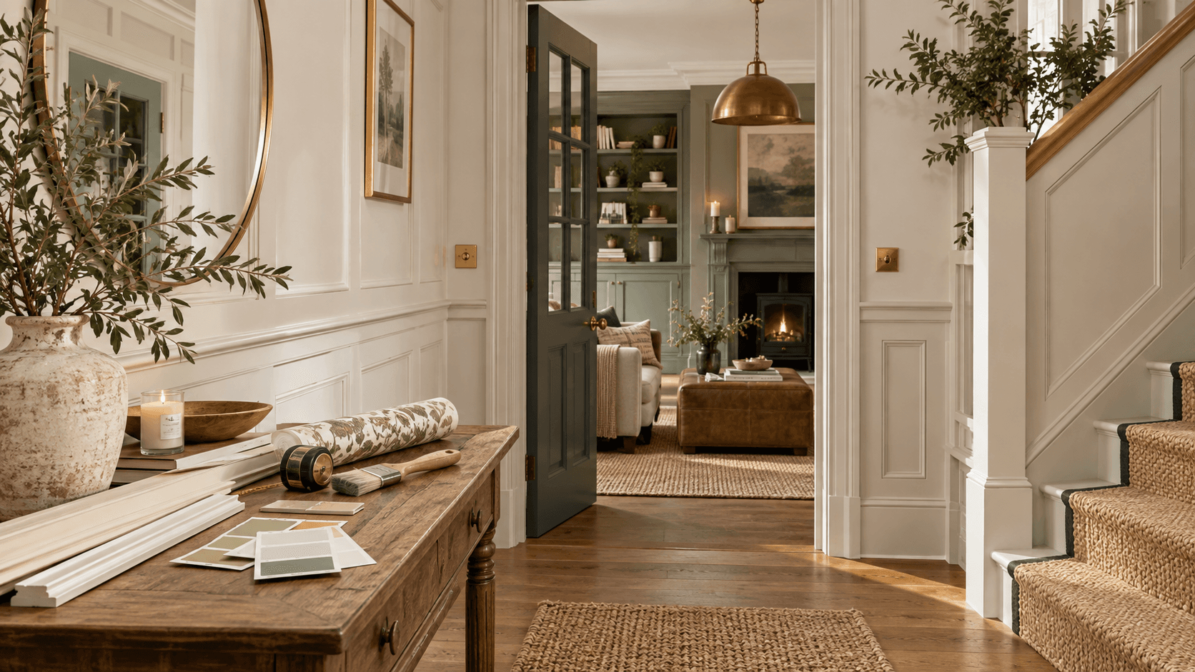
Wall panelling and moulding is one of those projects where the finished result can look far more expensive than the materials involved. A lot of the cost in having it professionally installed comes from the measuring, cutting, fitting, filling, sanding and painting, which makes it a particularly good project to take on yourself.
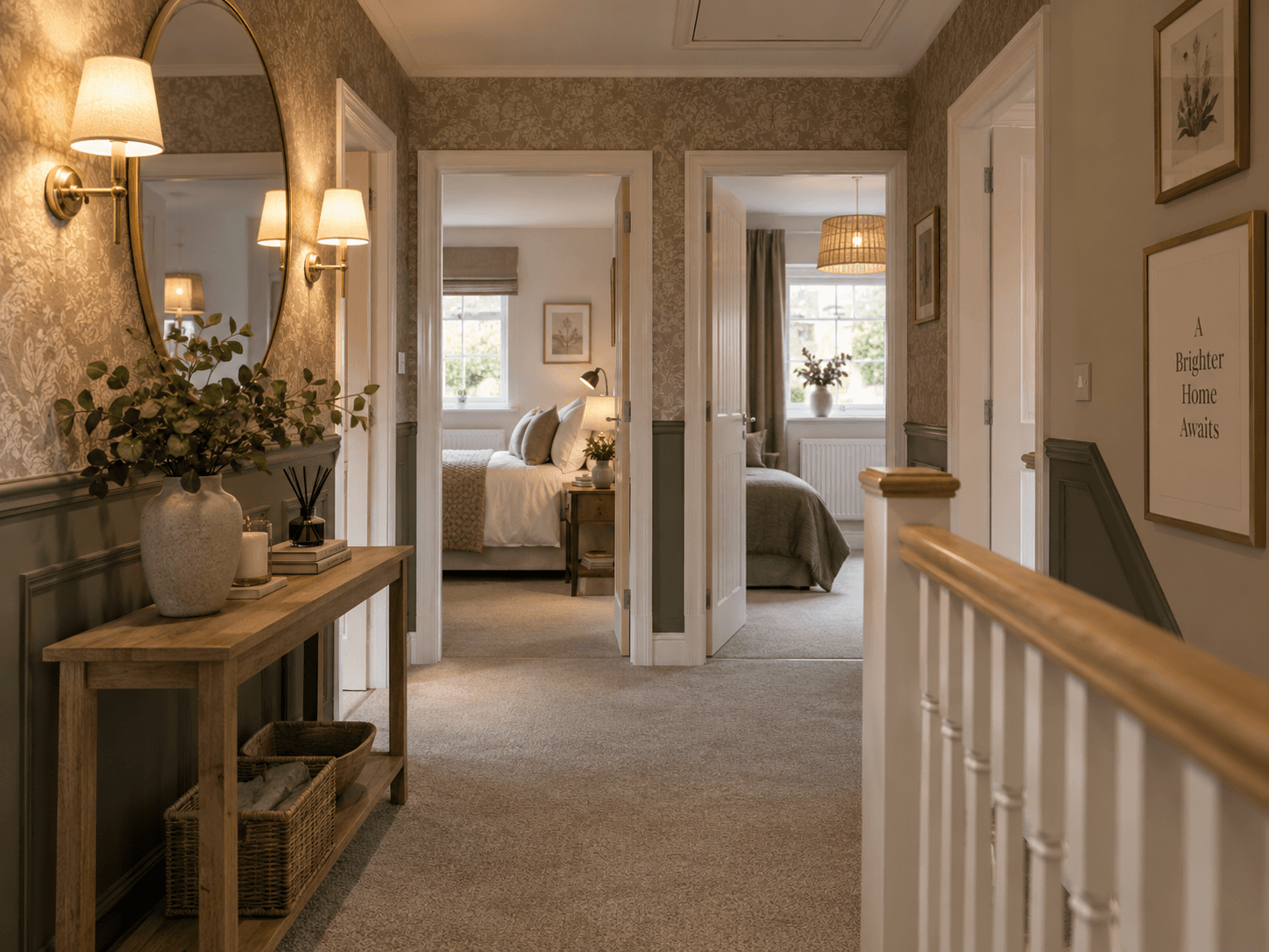
You do not need to cover every wall either. A simple run of picture frame moulding through a hallway, shaker style panelling in a bedroom or a dado detail carried up a staircase can completely change the proportions of a room and give a newer property some of the architectural character it may be missing.
MDF moulding, timber trim and pre cut decorative profiles are all relatively accessible, and once painted they can look every bit as considered as much more expensive joinery. The important part is getting the layout right before you start. Measure the wall properly, work out the spacing, account for sockets and switches and mark everything out first. Small differences in spacing become very obvious once the moulding is on the wall.
This is also a good place to save on materials without compromising the finish. Expensive timber is rarely necessary if everything is being painted. Spend your time instead on the preparation: clean cuts, filled joins, neat caulking and properly sanded edges are what make the finished wall look professionally done.
Paint can then take it in completely different directions. Keeping the walls, moulding and woodwork in the same colour creates a quieter, more architectural finish, while using a deeper shade or contrasting colour can turn the panelling into the main feature of the room.
For us, this is one of the best examples of where DIY can genuinely save money without the finished room looking like you have compromised. The materials are relatively simple. It is the time and attention to detail that create the expensive looking finish.
Transform a Room with Paint and Wallpaper
Paint and wallpaper are often treated as the finishing layer of a room, but in interior design they can do far more than simply add colour. Used well, they can alter the perceived proportions of a space, change the way light behaves and give a room a completely different atmosphere without changing the architecture underneath.
Start with the light. A colour that looks beautifully warm on a paint card can behave very differently in a north facing room, while strong southern light can intensify warmer undertones. East and west facing rooms can change considerably throughout the day, so it is worth looking at samples in morning light, afternoon light and under artificial lighting before committing. * Undertones matter too*. Greiges, taupes, mushroom tones and off whites can look very similar on a colour chart but lean pink, green, yellow or grey once they are on the wall. Rather than choosing each colour in isolation, think in terms of a wider palette. Look at how the wall colour works with the woodwork, flooring, furniture, textiles and any adjoining rooms that remain visible through open doorways.
Colour cards and curated paint palettes can be really useful for building a scheme. Look at shades within the same tonal family, then introduce contrast through depth or temperature. A deeper version of the wall colour on joinery can add definition without creating a hard break, while painting walls, skirting, architraves and even the ceiling in related tones can create a softer, more immersive colour drenched effect.
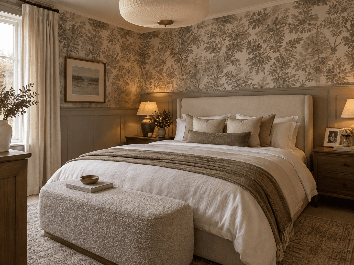
Wallpaper introduces another layer. Scale is just as important as colour. Larger repeats can make a room feel more confident and decorative, while smaller patterns often read more as texture from a distance. Wallpaper can also work beautifully above half height panelling, inside an alcove, behind a headboard or within built in shelving rather than covering every wall.
Before buying several litres of paint or multiple rolls of wallpaper, use the AI Visualiser to explore different combinations in the actual room. Try warmer and cooler palettes, different wallpaper scales, colour drenched woodwork or a deeper ceiling and compare the options before committing. It is especially useful if you are working around flooring, cabinetry or furniture that is staying.
If you are decorating with a view to selling, it is usually worth taking a slightly more neutral approach. Warm off whites, soft greiges, taupes, muted stone shades and gentle earthy tones still give a room depth, but they also make it easier for buyers to imagine their own furniture, artwork and colour choices in the space. Personality can still come through lighting, timber, texture and softer furnishings, while the more permanent finishes remain broadly appealing.
Doing the decorating yourself is where the saving comes in, but the design still deserves the same level of thought as a professionally finished scheme. Good preparation, careful cutting in, properly matched wallpaper and a well resolved colour palette are what make a relatively inexpensive project feel intentional rather than simply newly painted.
Upgrade Your Existing Kitchen
A kitchen does not need to be stripped back to the walls to feel completely reworked. If the carcasses are sound and the footprint already functions, the more interesting design exercise is often deciding what can stay and where a relatively small intervention will have the greatest visual impact. Current kitchen design thinking increasingly places function, flow and storage ahead of simply replacing everything for the sake of a new aesthetic.
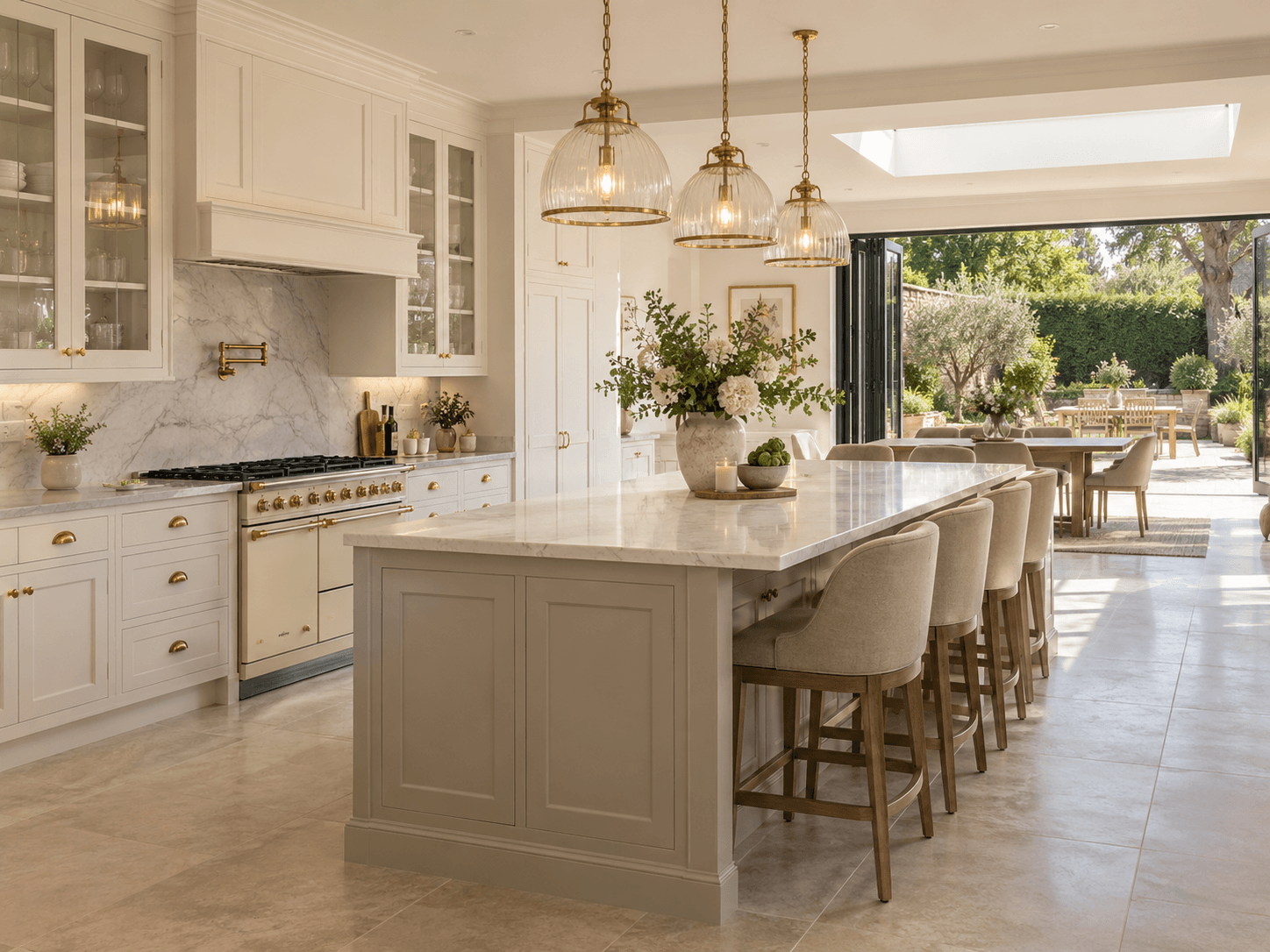
Start with the cabinetry because it establishes most of the visual weight in the room. Existing doors can be painted or vinyl wrapped where the surface is suitable, while fronts that are damaged, heavily dated or simply the wrong style can be replaced without disturbing the carcasses underneath. Flat doors can also be given more architectural definition with applied moulding. If there is an awkward gap above the wall units, consider taking the cabinetry visually towards the ceiling with additional cupboards, infill panels or a stronger cornice. It immediately makes standard cabinetry feel more integrated and gives you an opportunity to use otherwise wasted vertical space. Refacing, changing doors and adding moulding are all established ways of updating cabinetry without starting again.
Treat the colour palette as a composition rather than choosing a cabinet colour on its own. Look at the undertones within the worktop, flooring and existing wall colour, then introduce complementary tones rather than trying to make everything match. Warm stone cabinetry might sit alongside oak and aged brass, while olive or muted green works beautifully with softer off whites, warm timber and natural stone. Darker cabinetry can be particularly effective when balanced with lighter surfaces or walls so that the room retains contrast and light rather than becoming visually heavy.
Hardware is the jewellery of a kitchen, but scale matters as much as finish. A handle that is too small for a wide drawer or too delicate for a substantial cabinet can make the proportions feel slightly wrong even when the hardware itself is beautiful. Look at cup pulls, knobs, latches and longer handles as part of the architecture of the cabinetry and carry the metal finish through taps, lighting or smaller details where it makes sense. You do not necessarily need every piece to be identical, but the combination should feel intentional rather than accumulated.
Then look at the splashback. Tiles are one of the easiest places to move an existing kitchen in a completely different direction. Metro tiles, handmade or zellige style surfaces, tonal stone, stacked layouts, vertical formats and herringbone can each change the character of the same cabinetry. Grout colour matters too. A close tonal match creates a quieter continuous surface, while stronger contrast makes the geometry of the tile much more visible. You can also think beyond the conventional strip of tiles behind the worktop, with full height tiled areas, washable finishes or more continuous surfaces where appropriate.
Lighting should be layered rather than relying on a grid of ceiling spots. Under cabinet lighting gives useful illumination directly onto preparation surfaces, while softer ambient lighting changes the mood once the practical work is finished. A statement pendant over an island, peninsula or dining table can give an otherwise standard kitchen a focal point, but its scale and position should never interfere with sightlines, opening cupboards or the areas where you actually cook and prepare food. Warm light and dimmable sources can also make hard kitchen finishes feel noticeably softer in the evening.
Appliance placement deserves the same attention. Rather than arranging the room entirely around how it photographs, think about the sequence of using it. The traditional relationship between fridge, sink and cooking area is still a useful sense check, while contemporary kitchen planning increasingly thinks in zones based on how a household actually cooks and moves through the space. A fridge needs somewhere nearby to put food down, a dishwasher makes sense close to the sink, and preparation space should not constantly be interrupted by people crossing the room.
Then clear the worktops. A room can have beautiful cabinetry and expensive finishes and still feel visually unsettled if every surface is occupied. Kettles, coffee machines, air fryers, mixers and other appliances increasingly have their own appliance cupboards, allowing regularly used pieces to remain accessible without dominating the room. Even without bespoke cabinetry, giving each appliance a deliberate home and keeping the main preparation surfaces relatively clear can make an existing kitchen feel calmer almost immediately.
Storage should be designed around what you own rather than simply adding more cupboards. Deep drawers for pans, pull out larders, internal drawers, integrated bins, narrow tray storage, corner solutions and dedicated breakfast or coffee cupboards can dramatically improve how the kitchen functions. Good storage is not about filling every available wall with cabinetry. It is about making the contents easy to see, reach and return, which is why thoughtfully planned larders and internal storage can make relatively modest kitchens work far harder.
Not everything needs hiding. A glazed cabinet or a carefully edited run of shelving can break up a wall of solid doors and give you somewhere to display glassware, ceramics and pieces that deserve to be seen. Lighting inside glazed cabinetry can turn it into part of the evening lighting scheme too, creating depth rather than simply another storage cupboard. The important word is edited. A small collection of glassware feels intentional; an overfilled shelf quickly becomes visual clutter.
More characterful interventions can change the tone of the whole room. A Belfast or butler sink can introduce a more traditional note alongside Shaker cabinetry, timber and aged metals, while a contemporary tap or stronger tile choice can stop the scheme becoming overly country. Likewise, exposed pipework or an unattractive boiler can often be visually integrated into cabinetry rather than being left as the element the eye immediately lands on. Any boiler enclosure still needs to respect the appliance manufacturer’s requirements for access, clearances and ventilation.
The objective is not to make every kitchen look bespoke. It is to understand which details make a kitchen feel unresolved and deal with those first. Better hardware, a more sophisticated palette, clear worktops, well placed appliances, layered lighting and genuinely useful storage can alter the way an existing kitchen both looks and works without replacing perfectly serviceable units.
Before buying new doors, worktops or tiles, use the AI Visualiser to explore the existing room with different cabinet colours, hardware finishes, splashbacks, lighting and storage treatments. Seeing those elements together is often what reveals whether the kitchen actually needs replacing, or whether what it really needed was a more coherent design.